Dataquest: Beginner Python Tutorial: Analyze Your Personal Netflix Data
https://ift.tt/32eVZik

How much time have I spent watching The Office?
That’s a question that has run through my head repeatedly over the years. The beloved sitcom has been my top "comfort show/background noise" choice for a long time.
It used to be a question I couldn’t answer, because the data Netflix allowed users to download about their activity was extremely limited.
Now, though, Netflix allows you to download a veritable treasure-trove of data about your account. With a just a little Python and pandas programming, we can now get a concrete answer to the question: how much time have I spent watching The Office?
Want to find out how much time you have spent watching The Office, or any other show on Netflix?
In this tutorial, we’ll walk you through exactly how to do it step by step!
Having a little Python and pandas experience will be helpful for this tutorial, but it’s not strictly necessary. You can sign up and try our interactive Python for beginners course for free.
But first, let’s answer a quick question . . .
Can’t I Just Use Excel? Why Do I Need to Write Code?
Depending on how much Netflix you watch and how long you’ve had the service, you might be able to use Excel or some other spreadsheet software to analyze your data.
But there’s a good chance that will be tough.
The dataset you’ll get from Netflix includes every time a video of any length played â that includes those trailers that auto-play as you’re browsing your list.
So, if you use Netflix often or have had the streaming service for a long time, the file you’re working with is likely to be pretty big. My own viewing activity data, for example, was over 27,000 rows long.
Opening a file that big in Excel is no problem. But to do our analysis, we’ll need to do a bunch of filtering and performing calculations. With that much data, Excel can get seriously bogged-down, especially if your computer isn’t particularly powerful.
Scrolling through such a huge dataset trying to find specific cells and formulas can also become confusing fast.
Python can handle large datasets and calculations like this much more smoothly because it doesn’t have to render everything visually. And since we can do everything with just a few lines of code, it’ll be really easy to see everything we’re doing, without having to scroll through a big spreadsheet looking for cells with formulas.
Step 1: Download Your Netflix Data
For the purposes of this tutorial, I’ll be using my own Netflix data. To grab your own, make sure you’re logged in to Netflix and then visit this page. From the main Netflix screen, you can also find this page by clicking your account icon in the top right, clicking "Account", and then clicking "Download your personal information" on the page that loads.
On the next page, you should see this:

Click the red button to submit your data download request.
Click "Submit a Request." Netflix will send you a confirmation email, which you’ll need to click.
Then, unfortunately, you’ll have to wait. Netflix says preparing your data report can take up to 30 days. I once got one report within 24 hours, but another one took several weeks. Consider bookmarking this page so that you can come back once you’ve got your data.
If you’d like, I’ve also made a small sample from my own data available for download here. If you’d like, you can download that file and use it work through this project. Then, when your own data becomes available, simply substitute your file for the same, run your code again, and you’ll get your answers almost instantly!

When Netflix says it may take a month to get your data.
Netflix will email you when your report is available to download. When it is, act fast because the download will "expire" and disappear again after a couple of weeks!
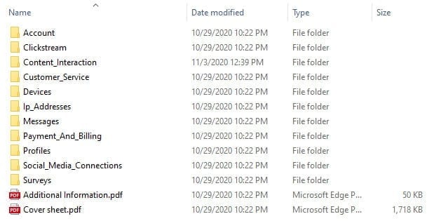
The download will arrive as a .zip file that contains roughly a dozen folders, most of which contain data tables in .csv format. There are also two PDFs with additional information about the data.
Step 2: Familiarize Yourself with the Data
This is a critical step in the data analysis process. The better we understand our data, the better our chances are of producing meaningful analysis.
Let’s take a look at what we’ve got. Here’s what we’ll see when we unzip the file:
Our goal here is to figure out how much time I’ve spent watching Netflix. Content Interaction seems like the most likely folder to contain that data. If we open it, we’ll find a file called ViewingActivity.csv that looks exactly like what we want â a log of everything we’ve viewed over the history of the account.

A sample of what the data looks like as a spreadsheet.
Looking at the data, we can quickly spot one potential challenge. There’s a single column, Title, that contains both show and episode titles, so we’ll need to do a little extra work to filter for only episodes of The Office.
At this point, it would be tempting to dive right into the analysis using that data, but let’s make sure we understand it first! In the downloaded zip file, there’s a file called Cover sheet.pdf that contains data dictionaries for all of the .csv files, including ViewingActivity.csv.
This data dictionary can help us answer questions and avoid errors. For example, consulting the dictionary for ViewingActivity.csv, we can see that the column Start Time uses the UTC timezone. If we want to analyze which times of day we most often watch Netflix, for example, we’ll need to convert this column to our local timezone.
Take some time to look over the data in ViewingActivity.csv and the data dictionary in Cover sheet.pdf before moving on to the next step!
Step 3: Load Your Data into a Jupyter Notebook
For this tutorial, we’ll be analyzing our data using Python and pandas in a Jupyter notebook. If you don’t already have that set up, you can find a quick, beginner-friendly guide at the beginning of this tutorial, or check out a more in depth Jupyter Notebook for Beginners post.
Once we’ve got a notebook open, we’ll import the pandas library and read our Netflix data CSV into a pandas dataframe we’ll call df:
import pandas as pd

df = pd.read_csv('ViewingActivity.csv')
Now, let’s do a quick preview of the data to make sure everything looks correct. We’ll start with df.shape, which will tell us the number of rows and columns in the dataframe we’ve just created.
That result means we have 27,353 rows and 10 columns. Now, let’s see what it looks like by previewing the first few rows of data using df.head().
To maintain some privacy, I’ll be adding the additional argument 1 inside the .head() parentheses so that only a single row prints in this blog post. In your own analysis, however, you can use the default .head() to print the first five rows.
table.tableizer-table {
font-size: 12px;
border: 1px solid #CCC; font-family: Arial, Helvetica, sans-serif;
} .tableizer-table td {
padding: 4px;
margin: 3px;
border: 1px solid #CCC;
}
.tableizer-table th {
background-color: #2A54A7; color: #FFF;
font-weight: bold;
}
|
Profile Name |
Start Time |
Duration |
Attributes |
Title |
Supplemental Video Type |
Device Type |
Bookmark |
Latest Bookmark |
Country |
| 0 |
Charlie |
2020-10-29 3:27:48 |
0:00:02 |
NaN |
The Office (U.S.): Season 7: Ultimatum (Episod… |
NaN |
Sony PS4 |
0:00:02 |
0:00:02 |
US (United States) |
Perfect!
Step 4: Preparing the Data for Analysis
Before we can do our number-crunching, let’s clean up this data a bit to make it easier to work with.
Dropping Unnecessary Columns (Optional)
First, we’ll start by dropping the columns we’re not planning to use. This is totally optional, and it’s probably not a good idea for large-scale or ongoing projects. But for a small-scale personal project like this, it can be nice to work with a dataframe that includes only columns we’re actually using.
In this case, we’re planning to analyze how much and when I’ve watched The Office, so we’ll need to keep the Start Time, Duration, and Title columns. Everything else can go.
To do this, we’ll use df.drop() and pass it two arguments:
- A list of the columns we’d like to drop
axis=1, which tells pandas to drop columns
Here’s what it looks like:
df = df.drop(['Profile Name', 'Attributes', 'Supplemental Video Type', 'Device Type', 'Bookmark', 'Latest Bookmark', 'Country'], axis=1)
df.head(1)
table.tableizer-table {
font-size: 12px;
border: 1px solid #CCC; font-family: Arial, Helvetica, sans-serif;
} .tableizer-table td {
padding: 4px;
margin: 3px;
border: 1px solid #CCC;
}
.tableizer-table th {
background-color: #2A54A7; color: #FFF;
font-weight: bold;
}
|
Start Time |
Duration |
Title |
| 0 |
2020-10-29 3:27:48 |
0:00:02 |
The Office (U.S.): Season 7: Ultimatum (Episod… |
Great! Next, let’s work with the time data.
Converting Strings to Datetime and Timedelta in Pandas
The data in our two time-related columns certainly looks correct, but what format is this data actually being stored in? We can use df.dtypes to get a quick list of the data types for each column in our dataframe:
df.dtypes
Start Time    object
Duration      object
Title         object
dtype: object
As we can see here, all three columns are stored as object, which means they’re strings. That’s fine for the Title column, but we need to change the two time-related columns into the correct datatypes before we can work with them.
Specifically, we need to do the following:
- Convert
Start Time to datetime (a data and time format pandas can understand and perform calculations with)
- Convert
Start Time from UTC to our local timezone
- Convert
Duration to timedelta (a time duration format pandas can understand and perform calculations with)
So, let’s approach those tasks in that order, starting with converting Start Time to datetime using pandas’s pd.to_datetime().
We’ll also add the optional argument utc=True so that our datetime data has the UTC timezone attached to it. This is important, since we’ll need to convert it to a different timezone in the next step.
We’ll then run df.dtypes again just to confirm that this has worked as expected.
df['Start Time'] = pd.to_datetime(df['Start Time'], utc=True)
df.dtypes
Start Time    datetime64[ns, UTC]
Duration                   object
Title                      object
dtype: object
Now we’ve got that column in the correct format, it’s time to change the timezone so that when we do our analysis, we’ll see everything in local time.
We can convert datetimes to any timezone using the .tz_convert() and passing it an argument with the string for the timezone we want to convert to. In this case, that’s 'US/Eastern'. To find your specific timezone, here’s a handy reference of TZ timezone options.
The tricky bit here is that we can only use .tz_convert() on a DatetimeIndex, so we need to set our Start Time column as the index using set_index() before we perform the conversion.
In this tutorial, we’ll then use reset_index() to turn it back into a regular column afterwards. Depending on your preference and goals, this may not be necessary, but for the purposes of simplicity here, we’ll try to do our analysis with all of our data in columns rather than having some of it as the index.
Putting all of that together looks like this:
# change the Start Time column into the dataframe's index
df = df.set_index('Start Time')

# convert from UTC timezone to eastern time
df.index = df.index.tz_convert('US/Eastern')

# reset the index so that Start Time becomes a column again
df = df.reset_index()

#double-check that it worked
df.head(1)
table.tableizer-table {
font-size: 12px;
border: 1px solid #CCC; font-family: Arial, Helvetica, sans-serif;
} .tableizer-table td {
padding: 4px;
margin: 3px;
border: 1px solid #CCC;
}
.tableizer-table th {
background-color: #104E8B; color: #FFF;
font-weight: bold;
}
|
Start Time |
Duration |
Title |
| 0 |
2020-10-28 23:27:48-04:00 |
0:00:02 |
The Office (U.S.): Season 7: Ultimatum (Episod… |
We can see this is correct because the previous first row in our dataset had a Start Time of 2020-10-29 03:27:48. During Daylight Savings Time, the U.S. Eastern time zone is four hours behind UTC, so we can see that our conversion has happened correctly!
Now, let’s deal with our Duration column. This is, as the name suggests, a duration â a measure of a length of time. So, rather than converting it to a datetime, we need to convert it to a timedelta, which is a measure of time duration that pandas understands.
This is very similar to what we did when converting the Start Time column. We’ll just need to use pd.to_timedelta() and pass it the column we want to convert as an argument.
Once again, we’ll use df.dtypes to quickly check our work.
df['Duration'] = pd.to_timedelta(df['Duration'])
df.dtypes
Start Time    datetime64[ns, US/Eastern]
Duration                 timedelta64[ns]
Title                             object
dtype: object
Perfect! But we’ve got one more data preparation task to handle: filtering that Title column so that we can analyze only views of The Office.
Filtering Strings by Substring in pandas Using str.contains
There are many ways we could approach filtering The Office views. For our purposes here, though, we’re going to create a new dataframe called office and populate it only with rows where the Title column contains 'The Office (U.S.)'.
We can do this using str.contains(), giving it two arguments:
'The Office (U.S.)', which is the substring we’re using to pick out only episodes of The Office.regex=False, which tells the function that the previous argument is a string and not a regular expression.
Here’s what it looks like in practice:
# create a new dataframe called office that that takes from df
# only the rows in which the Title column contains 'The Office (U.S.)'
office = df[df['Title'].str.contains('The Office (U.S.)', regex=False)]
Once we’ve done this, there are a few ways we could double-check our work. For example, we could use office.sample(20) to inspect a random ten rows of our new office dataframe. If all twenty rows contained Office episodes, we could be pretty confident things worked as expected.
For the purposes of preserving a little privacy in this tutorial, though, I’ll run office.shape to check the size of the new dataframe. Since this dataframe should contain only my views of The Office, we should expect it to have significantly fewer rows than the 27,000+ row df dataset.
Filtering Out Short Durations Using Timedelta
Before we really dig in and analyze, we should probably take one final step. We noticed in our data exploration that when something like an episode preview auto-plays on the homepage, it counts as a view in our data.
However, watching two seconds of a trailer as you scroll past isn’t the same as actually watching an episode! So let’s filter our office dataframe down a little bit further by limiting it to only rows where the Duration value is greater than one minute. This should effectively count the watchtime for partially watched episodes, while filtering out those short, unavoidable "preview" views.
Again, office.head() or office.sample() would be good ways to check our work here, but to maintain some semblance of privacy, I’ll again use df.shape just to confirm that some rows were removed from the dataframe.
office = office[(office['Duration'] > '0 days 00:01:00')]
office.shape
(5005, 3)
That looks good, so let’s move on to the fun stuff!
Analyzing the Data

When you realize how much time you’ve spent watching the same show.
How much time have I spent watching The Office?
First, let’s answer the big question: How much time have I spent watching The Office?
Since we’ve already got our Duration column in a format that pandas can compute, answering this question is quite straightforward. We can use .sum() to add up the total duration:
office['Duration'].sum()
Timedelta('58 days 14:03:33')
So, I’ve spent a total of 58 days, 14 hours, 3 minutes and 33 seconds watching The Office on Netflix. That is . . . a lot.
In my defense, that’s over the course of a decade, and a good percentage of that time wasn’t spent actively watching! When I’m doing brain-off work, working out, playing old video games, etc., I’ll often turn The Office on as a kind of background noise that I can zone in and out of. I also used to use it as a kind of white noise while falling asleep.
But we’re not here to make excuses for my terrible lifestyle choices! Now that we’ve answered the big question, let’s dig a little deeper into my The Office-viewing habits:
When do I watch The Office?
Let’s answer this question in two different ways:
- On which days of the week have I watched the most Office episodes?
- During which hours of the day do I most often start Office episodes?
We’ll start with a little prep work that’ll make these tasks a little more straightforward: creating new columns for "weekday" and "hour".
We can use the .dt.weekday and .dt.hour methods on the Start Time column to do this and assign the results to new columns named weekday and hour:
office['weekday'] = office['Start Time'].dt.weekday
office['hour'] = office['Start Time'].dt.hour

# check to make sure the columns were added correctly
office.head(1)
table.tableizer-table {
font-size: 12px;
border: 1px solid #CCC; font-family: Arial, Helvetica, sans-serif;
} .tableizer-table td {
padding: 4px;
margin: 3px;
border: 1px solid #CCC;
}
.tableizer-table th {
background-color: #104E8B; color: #FFF;
font-weight: bold;
}
|
Start Time |
Duration |
Title |
weekday |
hour |
| 1 |
2020-10-28 23:09:43-04:00 |
0 days 00:18:04 |
The Office (U.S.): Season 7: Classy Christmas:… |
2 |
23 |
Now, let’s do a little analysis! These results will be easier to understand visually, so we’ll start by using the %matplotlib inline magic to make our charts show up in our Jupyter notebook. Then, we’ll import matplotlib.
%matplotlib inline
import matplotlib
Now, let’s plot a chart of my viewing habits by day of the week. To do this, we’ll need to work through a few steps:
- Tell pandas the order we want to chart the days in using
pd.Categorical â by default, it will plot them in descending order based on the number of episodes watched on each day, but when looking at a graph, it’ll be more intuitive to see the data in Monday-Sunday order.
- Count the number of episodes I viewed on each day in total
- Sort and plot the data
(There are also many other ways we could approach analyzing and visualizing this data, of course.)
Let’s see how it looks step by step:
# set our categorical and define the order so the days are plotted Monday-Sunday
office['weekday'] = pd.Categorical(office['weekday'], categories=
    [0,1,2,3,4,5,6],
    ordered=True)

# create office_by_day and count the rows for each weekday, assigning the result to that variable
office_by_day = office['weekday'].value_counts()

# sort the index using our categorical, so that Monday (0) is first, Tuesday (1) is second, etc.
office_by_day = office_by_day.sort_index()

# optional: update the font size to make it a bit larger and easier to read
matplotlib.rcParams.update({'font.size': 22})

# plot office_by_day as a bar chart with the listed size and title
office_by_day.plot(kind='bar', figsize=(20,10), title='Office Episodes Watched by Day')
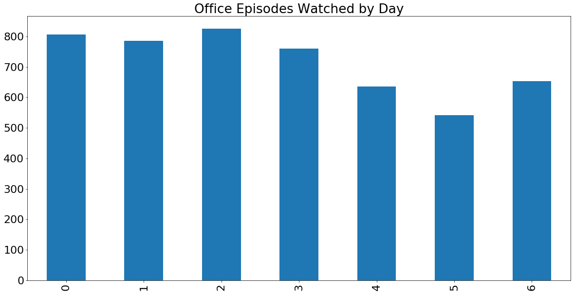
The Office views by day, Mon-Sun.
As we can see, I’ve actually tended to watch The Office more during the week than on weekends. This makes sense based on my habits, since it’s often background noise during evening work, workouts, etc.
Now, let’s take a look at the same data by hour. The process here is very similar to what we just did above:
# set our categorical and define the order so the hours are plotted 0-23
office['hour'] = pd.Categorical(office['hour'], categories=
    [0,1,2,3,4,5,6,7,8,9,10,11,12,13,14,15,16,17,18,19,20,21,22,23],
    ordered=True)

# create office_by_hour and count the rows for each hour, assigning the result to that variable
office_by_hour = office['hour'].value_counts()

# sort the index using our categorical, so that midnight (0) is first, 1 a.m. (1) is second, etc.
office_by_hour = office_by_hour.sort_index()

# plot office_by_hour as a bar chart with the listed size and title
office_by_hour.plot(kind='bar', figsize=(20,10), title='Office Episodes Watched by Hour')
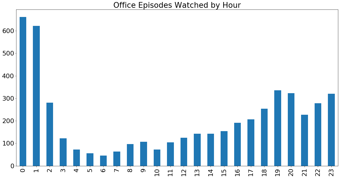
The Office views by hour, AM-PM
From the data, it looks like 12 a.m. and 1 a.m. were the hours during which I most often started episodes of The Office. This is due to my (unhealthy) habit of using the show as white noise while going to sleep â many of these episodes probably auto-played while I was already asleep!
Outside of that, it’s no surprise to see that most of my viewing happened during the evenings.
(Note: This data actually may not reflect my real habits very well, because I lived in China for a significant portion of my Netflix account ownership. We didn’t account for that in this tutorial because it’s a unique situation that won’t apply for most people. If you’ve spent significant time in different timezones during your Netflix usage, then you may need to do some additional date filtering and timezone conversion in the data cleaning stage before analysis.)
What’s Next?
In this tutorial, we’ve taken a quick dive into some personal Netflix data and learned that â among other things â I watch The Office too much. But there are tons of places you could go from here! Here are some ideas for expanding this project for yourself:
- Do the same or similar analysis for another show.
- See if you can create separate columns for show titles and episode titles using regular expressions [learn to use those in our Advanced Data Cleaning course)
- Figure out which specific episodes you’ve watched most and least
- Create prettier charts (our Storytelling with Data Visualization course can help with that)

When you realize your Netflix viewing habits have led to you finishing a cool project.
You can also try out some other fun projects using your own personal data. For example:
Want to learn to do this kind of project on your own, whenever you want? Our interactive data science courses will teach you to do all of this â and a whole lot more! â right in your browser window.
Charlie is a student of data science, and also a content marketer at Dataquest. In his free time, he’s learning to mountain bike and making videos about it.
The post Beginner Python Tutorial: Analyze Your Personal Netflix Data appeared first on Dataquest.
Python
via Planet Python https://ift.tt/1dar6IN
November 5, 2020 at 08:51PM




 The Statamic team outlined some


 After the DNS changes propagate your site will be live. The flow for future updates is login to the control panel on your test domain, write content, make edits and do CMS things. This will change the flat files in your project. When your site is looking good locally push the changes up to GitHub and your site will automatically be deployed! That’s what I’m doing for Epic Laravel and it’s working great 😉


 Installing PyCharm on
 I do not have a previous version of PyCharm or I do not want to import my settings. Click on OK and Accept the Privacy Policy. Keep the Install Config as it is set by default. Click OK.
 On the Welcome screen, you can do the following: