https://blog.jetbrains.com/wp-content/uploads/2024/10/compact.png
Maybe you’ve heard complicated-sounding phrases such as ‘“Students t-test”, “regression models”, “support vector machines”, and so on. You might think there’s so much you need to learn before you can explore and understand your data, but I am going to show you two tools to help you go faster. These are summary statistics and graphs.
Summary statistics and graphs/plots are used by new and experienced data scientists alike, making them the perfect building blocks for exploring data.
We will be working with this dataset available from Kaggle if you’d like to follow along. I chose this dataset because it has several interesting properties, such as multiple continuous and categorical variables, missing data, and a variety of distributions and skews. I’ll explain each variable I work with and why I chose each one to show you the tools you can apply to your chosen data set.
In our previous blog posts, we looked at where to get data from and bring that data into PyCharm. You can look at steps 1 and 2 from our blog post entitled 7 ways to use Jupyter notebooks in PyCharm to create a new Jupyter notebook and import your data as a CSV file if you need a reminder. You can use the dataset I linked above or pick your own for this walkthrough.
We’re going to be using the pandas library in this blog post, so to ensure we’re all on the same page, your code should look something like the following block in a Jupyter notebook – you’ll need to change the spreadsheet name and location to yours, though. Make sure you’ve imported matplotlib, too, as we will be using that library to explore our data.
import pandas as pd
import matplotlib as plt


df = pd.read_csv('../data/AmesHousing.csv')
df
When you run that cell, PyCharm will show you your DataFrame, and we can get started.
Try PyCharm Professional for free
Summary statistics
When we looked at where to get data from, we discussed continuous and categorical variables. We can use Jupyter notebooks inside PyCharm to generate different summary statistics for these, and, as you might have already guessed, the summary statistics differ depending on whether the variables are continuous or categorical.
Continuous variables summary statistics
First, let’s see how we can view our summary statistics. Click on the small bar graph icon on the right-hand side of your DataFrame and select Compact:

Let me give you a little tip here if you’re unsure which variables are continuous and which are categorical, PyCharm shows different summary statistics for each one. The ones with the mini graphs (blue in this screenshot) are continuous, and those without are categorical.
This data set has several continuous variables, such as Order, PID, MS SubClass, and more, but we will focus on Lot Frontage first. That is the amount of space at the front of the property.
The summary statistics already give us some clues:
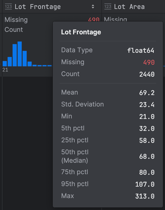
There’s a lot of data here, so let’s break it down and explore it to understand it better. Immediately, we can see that we have missing data for this variable; that’s something we want to note, as it might mean we have some issues with the dataset, although we won’t go into that in this blog post!
First, you can see the little histogram in blue in my screenshot, which tells us that we have a positive skew in our data because the data tails off to the right. We can further confirm this with the data because the mean is slightly larger than the median. That’s not entirely surprising, given we’d expect the majority of lot frontages to be of a similar size, but perhaps there are a small number of luxury properties with much bigger lot frontages that are skewing our data. Given this skew, we would be well advised not to use the standard deviation as a measure of dispersion because that is calculated by using all data points, so it’s affected by outliers, which we know we have on one side of our distribution.
Next, we can calculate our interquartile range as the difference between our 25th percentile of 58.0 and our 75th percentile of 80.0, giving us an interquartile range of 22.0. Alongside the interquartile range, it’s helpful to consider the median, the middle value in our data, and unlike the mean, it is not based on every data point. The median is more appropriate for Lot Frontage than the mean because it’s not affected by the outliers we know we have.
Since we’re talking about the median and interquartile range, it is worth saying that box plots are a great way to represent these values visually. We can ask JetBrains AI Assistant to create one for us with a prompt such as this:
Create code using matplotlib for a box plot for ‘Lot Frontage’. Assume we have all necessary imports and the data exists.
Here’s the code that was generated:
plt.figure(figsize=(10, 6))
plt.boxplot(df['Lot Frontage'].dropna(), vert=False)
plt.title('Box Plot of Lot Frontage')
plt.xlabel('Lot Frontage')
plt.show()
When I click Accept and run, we get our box plot:
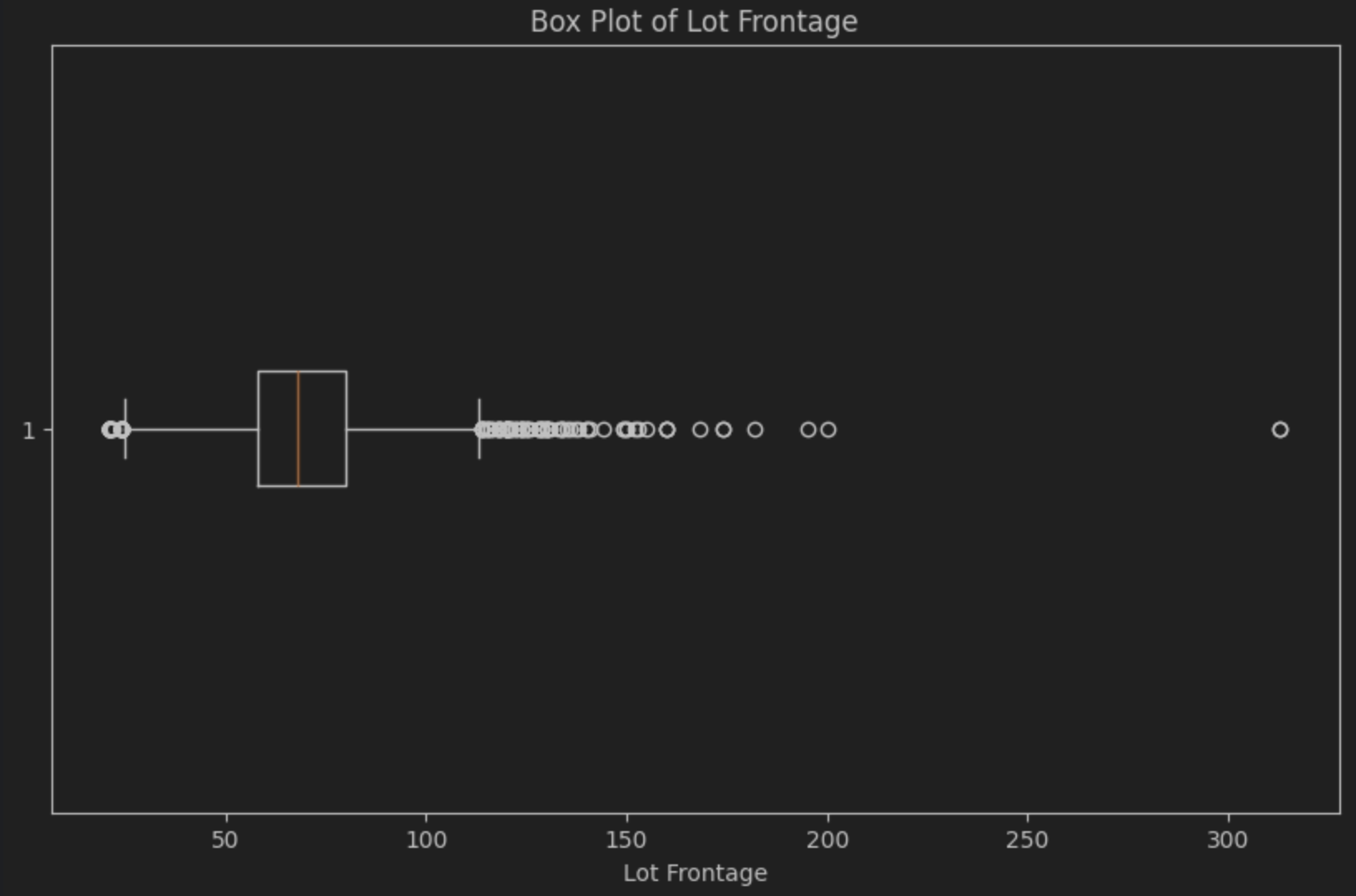
The median is the line inside the box, which, as you can see, is slightly to the left, confirming the presence of the positive or right-hand skew. The box plot also makes it very easy to see a noticeable number of outliers to the right of the box, known as “the tail”. That’s the small number of likely luxury properties that we suspect we have.
It’s important to note that coupling the mean and standard deviation or the median and IQR gives you two pieces of information for that data: a central tendency and the variance. For determining the central tendency, the mean is more prone to being affected by outliers, so it is best when there is no skew in your data, whereas the median is more robust in that regard. Likewise, for the variation, the standard deviation can be affected by outliers in your data. In contrast, the interquartile range will always tell you the distribution of the middle 50% of your data. Your goals determine which measurements you want to use.
Categorical variables summary statistics
When it comes to categorical variables in your data, you can use the summary statistics in PyCharm to find patterns. At this point, we need to be clear that we’re talking about descriptive rather than inferential statistics. That means we can see patterns, but we don’t know if they are significant.
Some examples of categorical data in this data set include MS Zoning, Lot Shape, and House Style. You can gain lots of insights just by looking through your data set. For example, looking at the categorical variable Neighborhood, the majority are stated as Other in the summary statistics with 75.8%. This tells you that there might well be a lot of categories in Neighborhood, which is something to bear in mind when we move on to graphs.
As another example, the categorical variable House Style states that about 50% of the houses are one-story, while 30% are two-story, leaving 20% that fall into some other category that you might want to explore in more detail. You can ask JetBrains AI for help here with a prompt like:
Write pandas code that tells me all the categories for ‘House Style’ in my DataFrame ‘df’, which already exists. Assume we have all the necessary imports and that the data exists.
Here’s the resulting code:
unique_house_styles = df['House Style'].unique()


print("Unique categories for 'House Style':")
print(unique_house_styles)
When we run that we can see that the remaining 20% is split between various codes that we might want to research more to understand what they mean:
Unique categories for ‘House Style’:
['1Story' '2Story' '1.5Fin' 'SFoyer' 'SLvl' '2.5Unf' '1.5Unf' '2.5Fin']
Have a look through the data set at your categorical variables and see what insights you can gain!
Before we move on to graphs, I want to touch on one more piece of functionality inside PyCharm that you can use to access your summary statistics called Explain DataFrame. You can access it by clicking on the purple AI icon on the top-right of the DataFrame and then choosing AI Actions | Explain DataFrame.
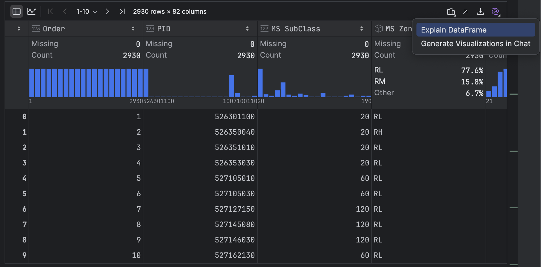
JetBrains AI lists out your summary statistics but may also add some code snippets that are helpful for you to get your data journey started, such as how to drop missing values, filter rows based on a condition, select specific columns, as well as group and aggregate data.
Graphs
Graphs or plots are a way of quickly getting patterns to pop out at you that might not be obvious when you’re looking at the numbers in the summary statistics. We’re going to look at some of the plots you can get PyCharm to generate to help you explore your data.
First, let’s revisit our continuous variable, Lot Frontage. We already learned that we have a positive or right-hand skew from the mini histogram in the summary statistics, but we want to know more!
In your DataFrame in PyCharm, click the Chart View icon on the left-hand side:

Now click the cog on the right-hand side of the chart that says Show series settings and select the Histogram plot icon on the far right-hand side. Click x to clear the values in the X axis and Y axis and then select Lot Frontage with group and sort for the X axis and Lot Frontage with count for the Y axis:
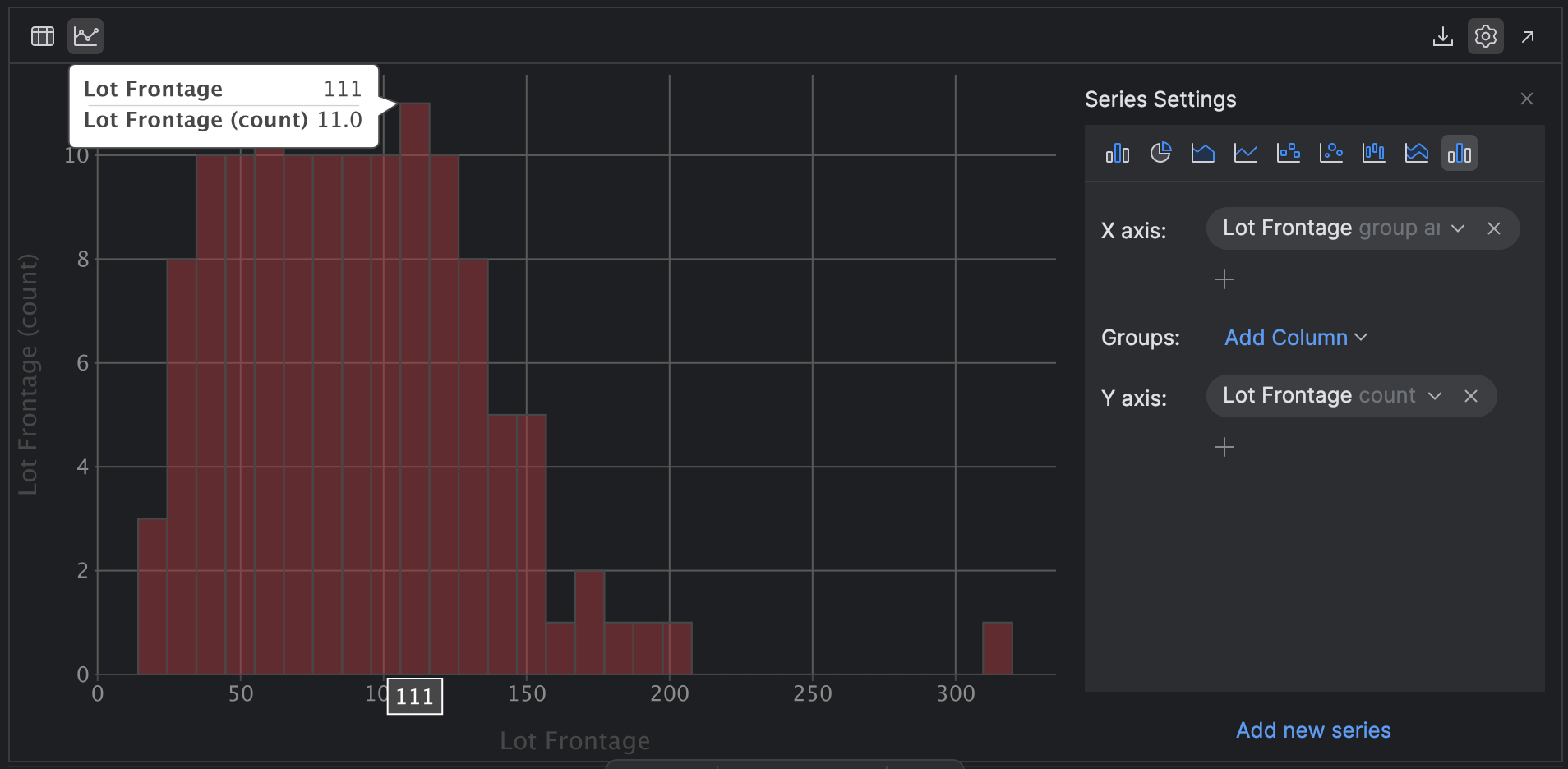
PyCharm generates the same histogram as you see in the summary settings, but we didn’t have to write a single line of code. We can also explore the histogram and mouse over data points to learn more.
Let’s take it to the next level while we’re here. Perhaps we want to see if the condition of the property, as captured by the Overall Cond variable, predicts the sale price.
Change your X axis SalePrice group and sort and your Y axis to SalePrice count and then add the group Overall Cond:
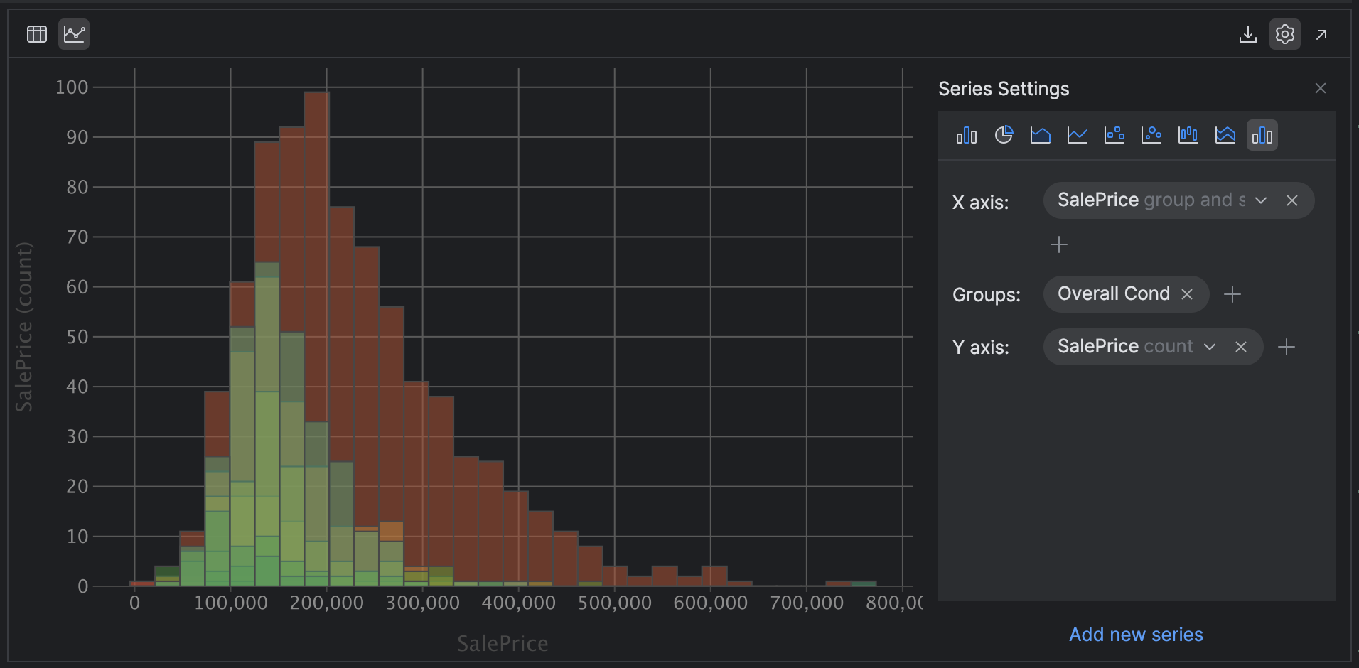
Looking at this chart, we can hypothesize that the overall condition of the property is indeed a predictor of the sale price, as the distribution and skew are remarkably similar. One small note is that grouping histograms like this works best when you have a smaller number of categories. If you change Groups to Neighborhood, which we know has many more categories, it becomes much harder to view!
Moving on, let’s stick with PyCharm’s plotting capabilities and explore bar graphs. These are a companion to frequency charts such as histograms, but can also be used for categorical data. Perhaps you are interested in Neighbourhood (a categorical variable) in relation to SalesPrice.
Click the Bar [chart] icon on the left-hand side of your series setting, then select Neighbourhood as Categories and SalesPrice with the median as the Values:
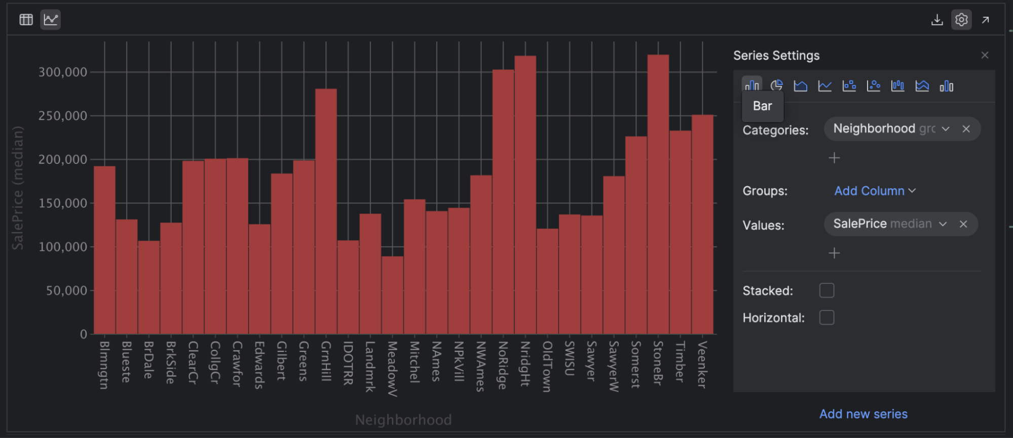
This helps us understand the neighborhoods with the most expensive and cheapest housing. I chose the median for the SalesPrice as it’s less susceptible to outliers in the data. For example, I can see that housing in Mitchel is likely to be substantially cheaper than in NoRidge.
Line plots are another useful plot for your toolkit. You can use these to demonstrate trends between continuous variables over a period of time. For example, select the Line [graph] icon and then choose Year Built as the X axis and SalePrice with the mean as the Y axis:
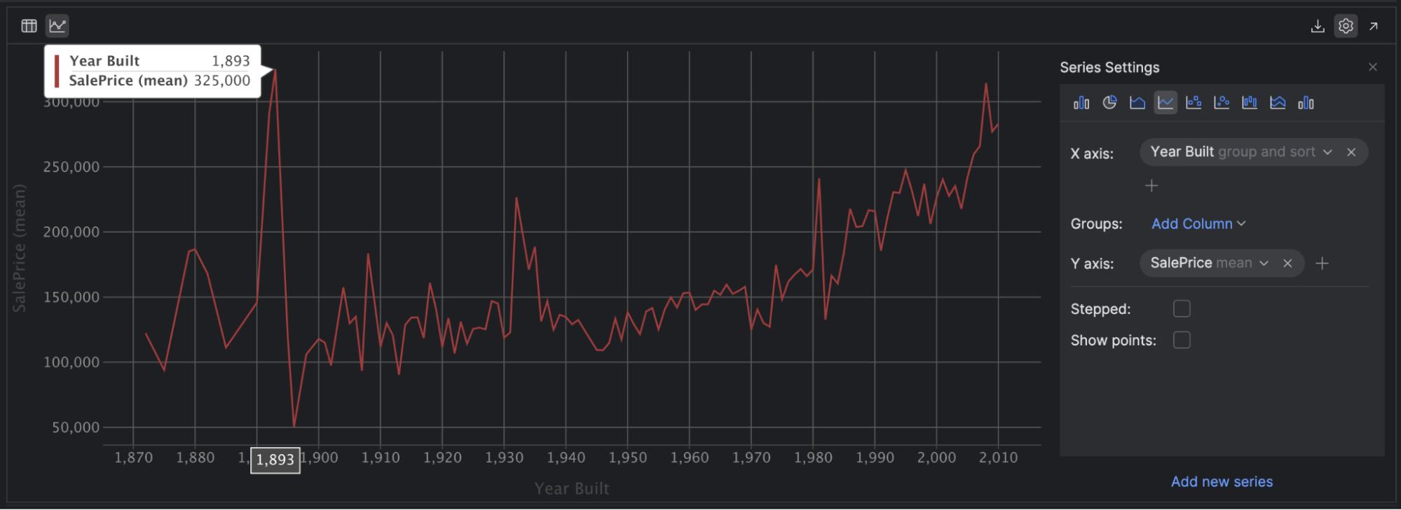
This suggests a small positive correlation between the year the house was built and the price of the house, especially after 1950. If you’re feeling adventurous, remove the mean from SalePrice and see how your graph changes when it has to plot every single price!
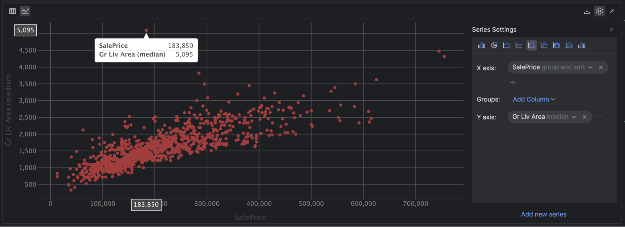
The last plot I’d like to draw your attention to is scatter plots. These are a great way to see a relationship between two continuous variables and any correlation between them. A correlation shows the strength of a relationship between two variables. To dig deeper, check out this beginner-friendly overview from Real Python.
For example, if we set our X axis to SalePrice and our Y axis to Gr LivArea, we can see that there is a positive correlation between the two variables, and we can also easily spot some outliers in our data, including a couple of houses with a lower sale price but a huge living area!
Summary
Here’s a reminder of what we’ve covered today. You can access your summary statistics in PyCharm either through Explain DataFrame with JetBrains AI or by clicking on the small graph icon on the right-hand side of a DataFrame called Column statistics and then selecting Compact. You can also use Detailed to get even more information than we’ve covered in this blog post.
You can get PyCharm to create graphs to explore your data and create hypotheses for further investigation. Some more commonly used ones are histograms, bar charts, line graphs, and scatter plots.
Finally, you can use JetBrains AI Assistant to generate code with natural language prompts in the AI tool window. This is a quick way to learn more about your data and start thinking about the insights on offer.
Download PyCharm Professional to try it out for yourself! Get an extended trial today and experience the difference PyCharm Professional can make in your data science endeavors. Use the promotion code “PyCharmNotebooks” at checkout to activate your free 60-day subscription to PyCharm Professional. The free subscription is available for individual users only.
Try PyCharm Professional for free
Using both summary statistics and graphs in PyCharm, we can learn a lot about our data, giving us a solid foundation for our next step – cleaning our data, which we will talk about in the next blog post in this series.
Planet Python