
Facebook is clearly very serious about its mission to connect the world and in the process, it has launched solar-powered drones that use lasers to connect to each other and the ground, and more prosaic efforts like new antennas for covering both urban and rural areas. Today, Facebook is expanding this work with the launch of OpenCellular, a new open source hardware and software project that aims to bring a more affordable wireless access platform to remote areas.
“One of the reasons the expansion of cellular networks has stalled is that the ecosystem is constrained,” Facebook engineer Kashif Ali writes. “Traditional cellular infrastructure can be very expensive, making it difficult for operators to deploy it everywhere and for smaller organizations or individuals to solve hyperlocal connectivity challenges. It’s often unaffordable for them to attempt to extend network access in both rural and developed communities.”
Ali previously co-founded Endaga, which worked on a somewhat similar project. Facebook acquired the company last October. He also notes that one of the goals of the projects was to build a system with very little physical footprint and the ability to use already available infrastructure because the cost of the land, tower, power and security for setting up a cellular network is often higher than that of the actual access point itself.
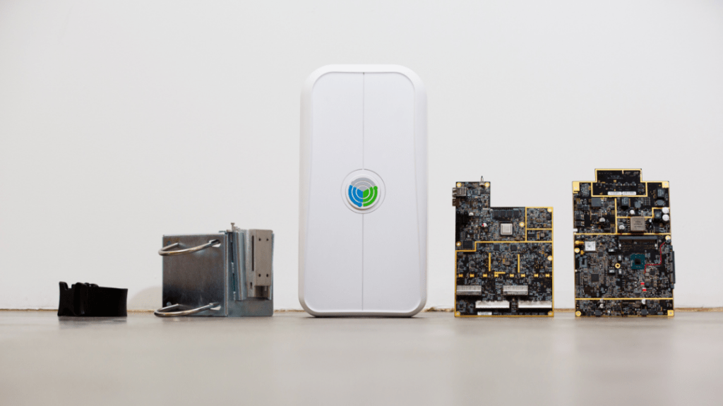
Facebook says OpenCellular will consist of two main subsystems: one for general purpose and base-band computing, and one to handle the actual radio. Both of those systems were designed to be somewhat modular. The radio system, for example, could be based on a software-defined radio or on a system-on-chip solution. While the focus here is on providing wireless access to the Internet over anything from a 2G to LTE network, OpenCellular could also be used to provide a local network, too.
These devices will likely be deployed in rather harsh conditions, so both the industrial and mechanical design aims to make them rugged enough to withstand high winds and extreme temperatures while still being small enough to be deployed by a single person.
Facebook says it will open source the hardware design, firmware and control software for OpenCellular so telecom operators, entrepreneurs, researchers and OEMs will be able to build their own versions. It will also donate the work to the Telecom Infra Project, a Facebook-backed initiative for exploring new approaches to — well — telecom infrastructure basics like access and backhaul.
